Flattening the curve
I was expecting somehow people to pick up on the Corona data provided earlier, but nothing has surfaced here. So, let me stick my neck out. What I wanted to visualize rapidly is (a) level of incidence per GGD, (b) a metric that indicates whether the curve is flattening. My least concern at this quick-and-dirty moment of the day is legends and proper colour choices.
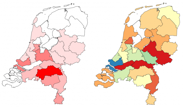
Both maps here show *absolute numbers* ... and they should actually show numbers per 100,000 inhabitants, say, to allow comparisons. I will do this tomorrow, need to think how to decently and automatically compute this.
The first map simply shows the number of people infected, as discovered by tests. (Remember we do not know whether testing is done consistently throughout the country; probably not.)
The second map shows an extremely simplistic metric of flattening: it determines the average growth of the curve over the last two days, and subtracts the average growth of the curve over the three days before that. Red means exponential growth still, colouring towards blue indicates a flattening is taking place. Again, these should become metrics against a standard 100,000 people.
Much better and more scientific metrics for curve flattening exist ...
Tomorrow!