Torque for mapping BIG temporal data

  • Posted on: 8 October 2012
  • By: köbben

Mapping data over time can be challenging, and with what nowadays should be called BIG DATA, it becomes even more difficult. The people of CartoDB, have now released a new tools called Torque, to make the process easier.

From the Torque Blog (http://blog.cartodb.com/post/32464928928/torque-big-data-meets-time-based-maps-bundled-with):
" Torque allows you to create beautiful visualizations with big temporal datasets by bundling HTML5 browser rendering technologies with a generic and efficient temporal data transfer format created using the CartoDB SQL API. Torque visualisations work on desktop and ipads, and work well on temporal datasets with hundreds of thousands or even millions of datapoints."

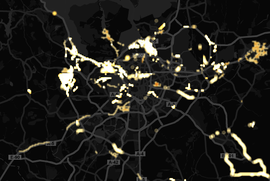
The map below gives you a sense of what Torque can help you do. The map animates historical edits to OpenStreetMap in Madrid.

See it in action at: http://cartodb.github.com/torque/examples/osm.html

Mapping the world Apple's way

  • Posted on: 21 September 2012
  • By: morales

 
By now we have all probably heard about the first reviews of users on Apple's recently launched map application for IOS 6. Apparently Apple kind of overlook the fact that this business is not just about the maps, but about the data. Anyways below you can see some examples where improvements are clearly needed.

 © news.cnet.com 

 
It seems that they made a mistake or did they, well according to Apple, it was all part of the plan. Read more at "iOS 6 map mess was no big surprise to Apple"". All in all, I figure that other web mapping providers out there might be quoting Napoleon's words "Never interrupt your enemy when he’s making a mistake". I hope something positive comes out of all this.

Not my patch: Visual Analysis

  • Posted on: 12 September 2012
  • By: deby
Figure 12 from the paper

Interactive Dynamics for Visual Analysis Paper by Jeffrey Heer (Stanford) and Ben Shneiderman (U Maryland)

Quoting from the paper, which I believe is a useful read for many of us:

"The goal of this article is to assist designers, researchers, professional analysts, procurement officers, educators, and students in evaluating and creating visual analysis tools. We present a taxonomy of interactive dynamics that contribute to successful analytic dialogues. The taxonomy consists of 1 2 task types grouped into three high-level categories, as shown in table 1: (1) data and view specification (visualize, filter, sort, and derive); (2) view manipulation (select, navigate, coordinate, and organize); and (3) analysis process and provenance (record, annotate, share, and guide). These categories incorporate the critical tasks that enable iterative visual analysis, including visualization creation, interactive querying, multiview coordination, history, and collaboration. Validating and evolving this taxonomy is a community project that proceeds through feedback, critique, and refinement."

Full paper is here:

Paper by Jeffrey Heer and Ben Shneiderman

Pages